
Studydrive Premium
Upgrading the visual brand experience of an ed-tech student platform.

From a Free to a Premium experience
StudyDrive is an ed-tech platform helping Gen Z students to share their study documents 100% for free. With a highly competitive market offering high-quality educational resources thanks to their strong user base, they had to shift to a paid strategy to stimulate user engagement and generate more valuable study content.
I lead the design of a Premium subscription for students that 6 months post launch resulted in 35% of monthly active users subscribing.
ROLE
UX/UI Design, Competitor & Market Research, New branding, User Flows
SKILLS
Figma, Miro, Lottie
Research, Wireframing
Prototyping
TEAM
2 Product Designer
2 Product Managers
6 Developers
TIME
8 weeks
BACKGROUD CONTEXT
Free downloads are cool, but not forever
In its early stages, our platform stood out for its extensive document repository. However, what truly breathed life into the community in recent years wasn't just study materials, but marketing the platform as a vibrant social media hub and incentivizing student contributors with rewards for document uploads.
However, here's the plot twist: facing competitors monetising through subscriptions, we recognised a pivotal moment. As a free platform, ensuring the continuous delivery of quality content and sustaining innovation demanded increased resources.
Our aim? The introduction of a premium service became a strategic move to align with our business goals:
-
Elevating user engagement. 🧑💻
-
Secure the necessary support for continuous enhancement. 🛠️
-
Assert leadership in the ed-tech market. 🚀
UNDERSTANDING THE PROBLEM
Before deciding on the right monetary strategy, a previous field approach was conducted before I joined the team, that provided enough insights in regards to the user sentiment over a paid experience, which understandably resulted in a general backlash.
_edited.jpg)
How could we seamlessly introduce payments for a once-free platform while maintaining a positive user experience?
The challenge extended beyond financial considerations to ensure they feel the new value proposition emotionally.
THE PROPOSED SOLUTION
I embarked on a journey to craft a brand identity that not only communicated enhanced features but also built trust. The user interface aimed to create a connection, making users perceive the true value even in a paid model. 🚀🎨
CHALLENGES
-
Create a process involving coming up with a whole new visual concept including new branding guidelines and new design system components that align with our current brand and Gen Z audience, for both the website and app.
-
Map and design the integration of the new subscription model across the Studydrive platform.
-
A later refinement lead me to reframe the main problem: The need of an alternative gratification method for active user contributors to enjoy Premium.
THE DISCOVERY PHASE
DEEPER INSIGHTS
Challenging the initial scope
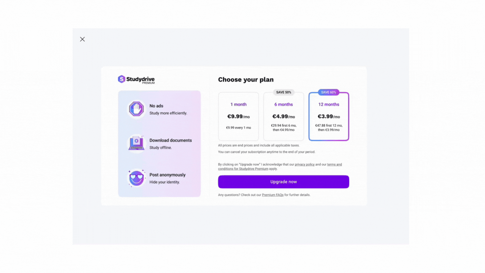
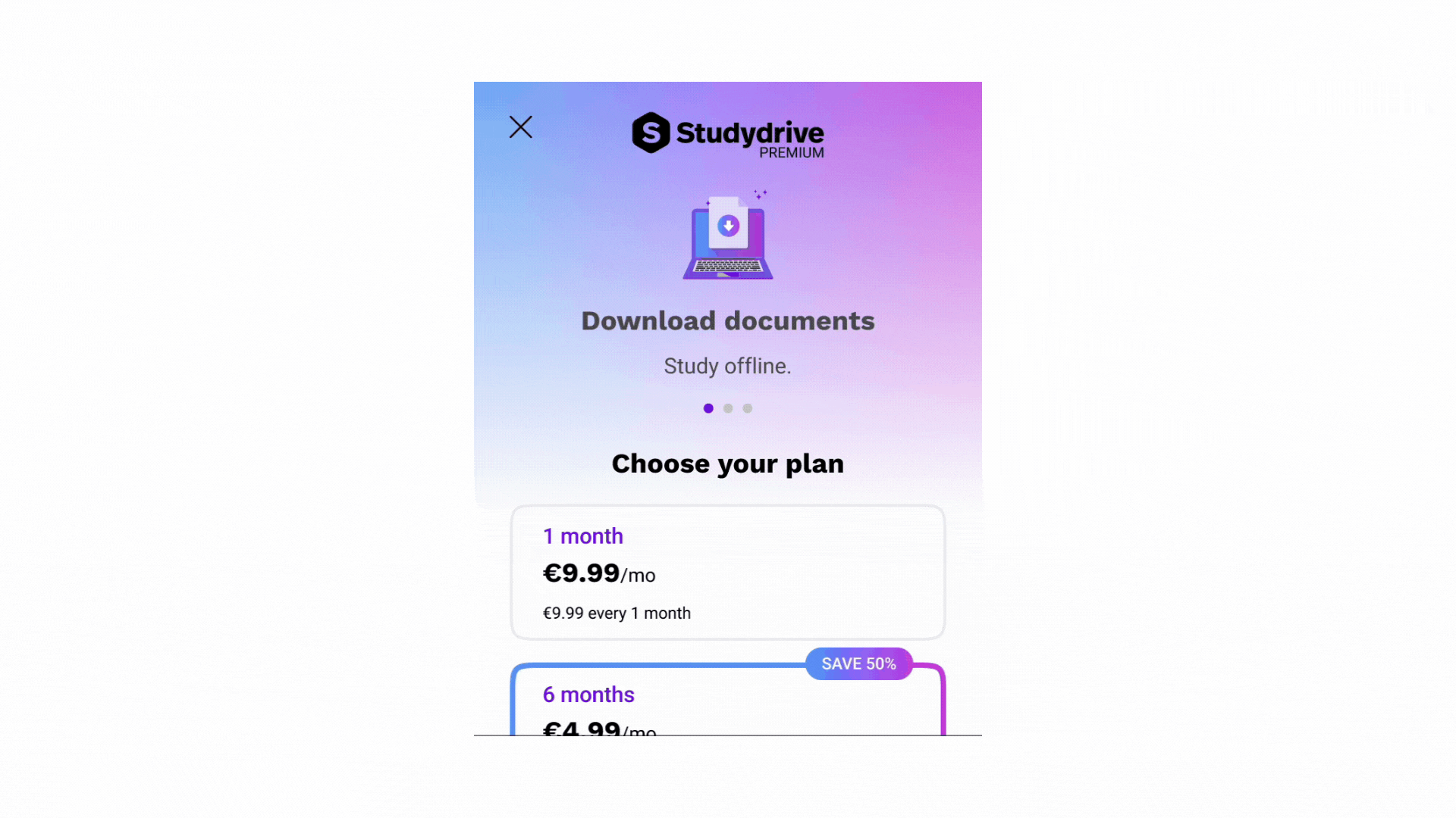
My original scope was to design a premium subscription shop screen including 3 paid features, and gradually keep adding new functionalities in the paid package. The ones included in the first release were:
-
The ability to download documents (document views were still free)
-
Allowing users to post anonymously
-
Enjoying an ad-free experience
However, in order to monetise from our new business model required further research and brand conceptualisation efforts to really captivate our vocal and strong opinionated user segment, our Gen Z students.
MARKET RESEARCH
Competitive analysis

Before diving into designs, I researched how other companies transitioned from free to paid models, focusing on entry points for implementing premium across the platform. Some interesting findings:
-
Top industry players lack Premium subscription prompts in their sign-up flows.
-
A common strategy involves using dark patterns, initially presenting users with the illusion of accessing a feature, only to be prompted to upgrade to Premium.
-
Many products use occasional pop-up modals to entice users to explore Premium options.
-
Close competitors delay Premium introduction until users log into the platform, skipping it on the website landing page.
SITE MAP
Identifying relationships with the status quo
After analysing how other brands integrate paid subscriptions and the premium features were decided, I decided to continue building up the structure of Studydrive using the site map, which helped to visualise the relationship between the content and examine the hierarchy.
-2.jpg)
DEFINING USER FLOWS
Mapping premium across the platform
Having integrated Premium I mapped a detailed overview of the user flows needed for the first release upon launch date. The minimum scope needed should at least include:
-
Main entry point to Premium from the Newsfeed and action prompts
-
Premium shop & payment flow
-
Premium user status
-
Manage subscription
-
Payment cancellation
At this point, understanding the paths the student would go through to become a Premium user guided the creation of a new branding, seamlessly integrating the upgraded character across the platform.
-2.jpg)
THE DESIGN PHASE
WIREFRAMES
Based on the previous market research and following the business requirements communicated by my Product Manager, I took an iterative brainstorming approach and came up with the following low-fidelity wireframes. Following a mobile-first approach to my designs helped me prioritise primary elements within space constraints, visual consistency and hierarchy before applying styles and implement scalable responsive designs afterwards.

IDEATION
Creating a new brand identity
To establish a cohesive brand strategy, I decided to join forces with our Lead Graphic Designer. We began by defining the brand's goals, visions, and values, focusing on differentiation, value perception, brand consistency, credibility, and trust.
The new premium identity would have the following attributes:
-
Elevated: Elevating the learning experience with curated content and advanced features.
-
Trustworthy: Building confidence and reliability through secure learning.
-
Quality: Setting the standard for quality content and study materials.
-
Confidence: Creating a secure space for open expression, free from judgment or repercussion.
-
Connected: Fostering genuine community connections.
The Logo
To further establish the brand identity, we applied different concepts to our current logo around the brand attributes we established. We shortlisted a few options and I finalised the top choices by examining their legibility at different scales.
.jpg)
The colour scheme & design criteria
One key challenge was defining the brand's visual aesthetics, particularly in choosing the right colors. During our brainstorming sessions, we considered different color themes that would potentially align with unique characteristics and preferences of our Gen Z student demographic as well as prioritising a set of criteria, specially:
✅ Accessibility compliance guidelines
✅ Premium look & feel
✅ Fit with existing color scheme (current branding)
✅ Market differentiation
✅ Integration with Y2K movement (current design trend among Gen Zs used in our platform)
I directly applied the themes to early iterations of mid-fidelity wireframes I quickly designed.


The use of gradients was a distinctive look that conveys a premium feel. By crafting a diverse color environment, we connected young students with a sense of independence and growth, elevating their study journey to a sophisticated yet enjoyable experience.
UI KIT
To ensure consistency and efficiency across the design process, I developed a Premium UI kit within our design system containing reusable components, styles, and guidelines.

DESIGN THINKING
Decisions that led to the final design
Responsive modal layout
For visibility purposes, I decided to go with a full-size screen modal. No matter where the user triggers this page from, it will always overlay the previous content, and not show any transparency behind. The reason is to keep a minimal view to bring the student focus to the white container, which includes the subscription information.
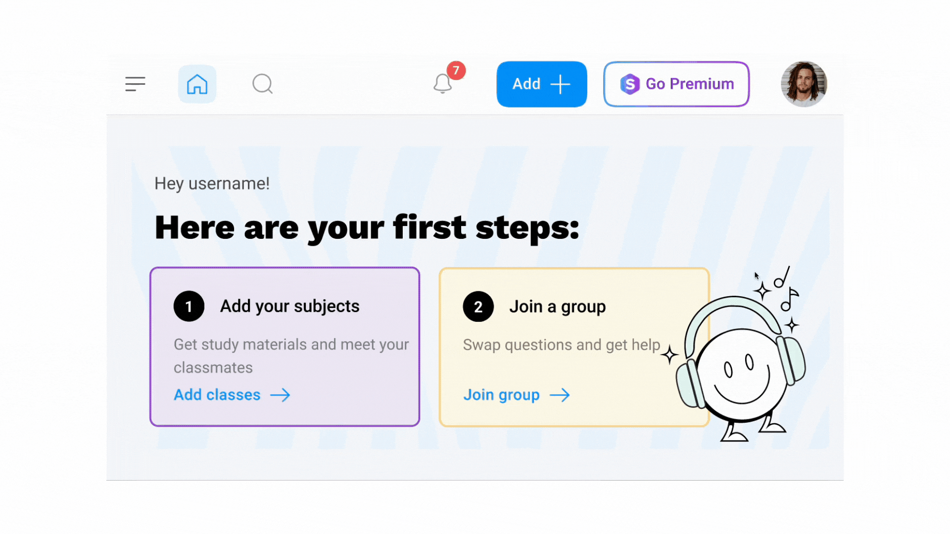
The Premium button
Due to a new redesign of our navigation simultaneously taking place, it took careful consideration, a few meetings and several iterations to decide where to locate the main Premium CTA. Maintaining Premium awareness remained a top priority to boost conversion.
The bare button style aimed to be prominent yet to avoid disrupting the students' natural flow. I used a gradient stroke and dynamic effects on hover state to create a playful effect evoking positive emotions and increase user satisfaction.
Premium prompt
To promote premium recognition and avoid dark patterns used in other platforms, I applied animated visual cues, providing a visually stimulating experience, guiding students towards the desired action and enticing further exploration of premium features. Subtle sparkle effects add a touch of whimsy and magic, capturing attention and sparking excitement and wonder.
Carousel component on small devices
Implementing a carousel on small screens aimed at maximize engagement by showcasing each premium feature individually, improving comprehension, and offering an interactive browsing experience. This design optimizes screen real estate, enhancing the shop screen's appeal, and effectively communicates the value of premium features.
Dedicated page to manage the Premium account
Introducing a dedicated page under the profile section offers easy access and control to manage the premium account.
HIGH-FIDELITY PROTOTYPES
The following screens represent key stages within the user experience across premium flows. To ensure clarity, I placed emphasis on app and LG website screens since our major user base comes from both devices. Even though not displayed here, I made sure to design for full responsiveness across all devices, including mobile website and tablet versions for both website and app.
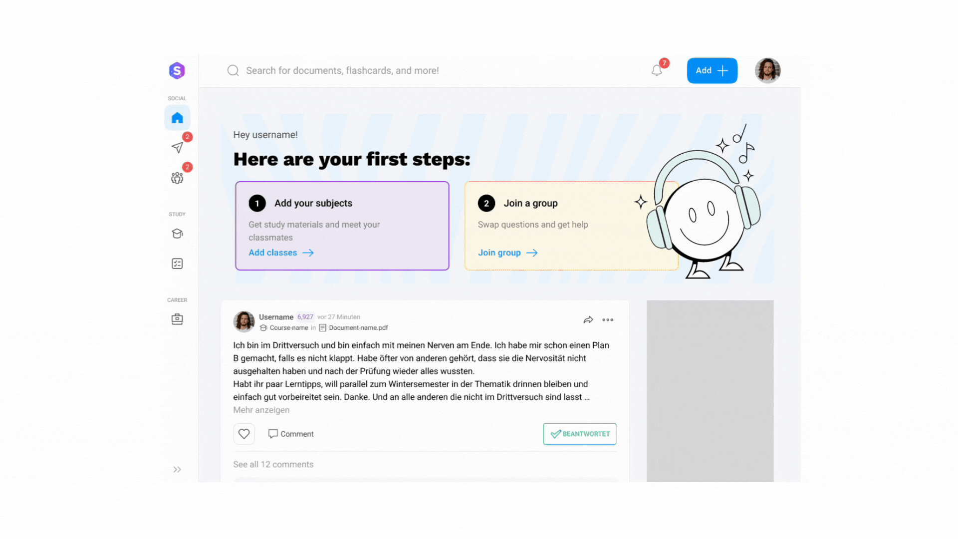
The student is scrolling through the newsfeed and notices the Premium button beckoning them to explore more, wondering what benefits await beyond the click.


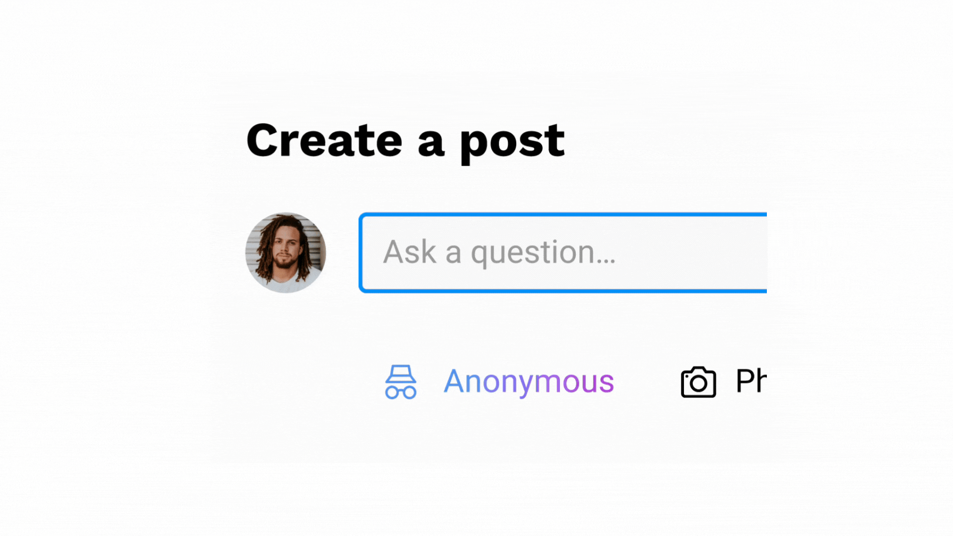
Alternatively, the student encounters a document they urgently need.
A document download prompt appears, offering instant access with Premium.


In the Premium shop, students are greeted with a clear overview of the Premium features and benefits, and the different plans to help them elevate their learning experience.


After completing the upgrade process, a reassuring success screen is displayed confirming visibility of their Premium status, providing a sense of accomplishment and anticipation for the enhanced experience ahead.


As part of the user profile, the Premium-dedicated page displays their upgraded status and subscription details as a reminder of their commitment to studying and having premium access to exclusive features.


THE RESULT
TESTING & FINDINGS
Validating the impact of the Premium solution
Due to time constraints and since the previous market research provided solid evidence on Premium best practices, before launching the upgrade to the wider user pool, a previous testing phase on the production environment was conducted with a select user group in NRW (Nordrhein-Westfalen Bundesland) and exclusively to German-speaking students during the first month post-launch.
Considering the initial user sentiment on a new paid model, the results of the test were surprisingly promising:
The performance test resulted in over 10% of users subscribing in the first two weeks, exceeding the target of 4.3%.
New users represented a 36% of the total subscriptions, proving and validating successful usability integration.
Document quality increased by 37%, verified through quantitative data on new uploads and user-rated document evaluations.
User engagement metrics saw a 30% rise in session duration and a 25% increase in premium content interactions, signaling increased emotional investment and readiness to pay for added value.
IMPROVEMENTS
Reevaluating Premium for our active users
We realised that introducing a paid service wasn't exactly the problem.
Despite the unexpected Premium subscriber milestone, a major concern arose: the majority of converted users were passive (regular users), meaning they represent the target segment who only search and download content, but doesn't contribute to uploading new study materials.
I then circled back to our previous user research and gathered the main pain points specifically coming from some of our student contributors:
- Why would they pay a platform when they have been actively contributing by sharing their own study materials?
- What do they receive in exchange?

It's worth remembering that student contributors already receive monetary and in kind rewards every time they hit a specific number of their document downloads. That was purposefully intended as a benefit exchange since the beginning.
However, it became the highest priority to address their concern since they represent a big fragment of our active users. Therefore, I had to find an immediate solution to make amends with them not only as gratitude for their time and effort spent on our platform sharing valuable study resources but also for advocating for Studydrive as their n°1 study platform. We didn't want to loose them.
NEXT STEPS
-
Engage in collaborative brainstorming with stakeholders to introduce an alternative payment method for student contributors to boost their engagement.
-
Conduct user testing and refine the payment method based on user feedback.
-
Iterate on the design to enhance user experience and maximise adoption and satisfaction.
-
Create a communication strategy to promote the benefits to student contributors.
LEARNINGS
This project has taught me how early communication with users is key when introducing new paid features. Even though there was previous user research on exploring platform monetization, more specific research on the selected subscription method would have provided early insights and helped us consider the diverse user groups and transparently share our reasons of why this change was needed, to keep supporting academic excellence and the best experience to our users.
Also, by leading the end-to-end process independently, I learned the value of taking ownership of my work and having the freedom to define and refine my own methods and approaches.